Thursday, July 30, 2009
Fixed Gear Bike Racing
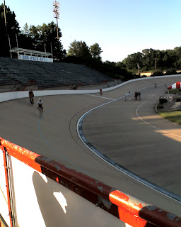
Jim had to build his bike to race at the Major Taylor Velodrome in Indianapolis. Jim actually has a fixed gear bike of his own that he built, but the pedals and gears are too low on the frame for the velodrome track angle. He ad reserved a bike last week, but apparently, the staff had given his and another one the same size away already.... So Jim was stuck 'creating' his own bike for the race in less than 10 minutes. Thank goodness he brought his own tools.
Tuesday, July 28, 2009
Monday, July 27, 2009
Multimedia message
I've got the medallions done for the Paris Beacon treasure hunt. This is one of five that are now gold.
Sunday, July 26, 2009
Saturday, July 25, 2009
Thursday, July 23, 2009
Inserts and Advertising
I work for a newspaper.
I can remember the days when each person did one job, and did it well. Today, however, Each person is multi-talented and is expected to perform multiple functions in the newspaper office. Feature writers cover sporting events, Page designers handle Business news, Advertising designers (like me) are creating special section magazine page layouts and broadsheet page design, and even, well, INSERTS!
two of my favorites so far have been for a local gym. See their examples below.


Painting the kitchen
So, We've finally gotten around to painting the kitchen. It was a light buttery yellow all over with my blue delft plates hung for decoration. Now, well, now it's an unknown color...
IS IT.... Peanut Butter?

NO not quite.
Is it Almond Butter?

Nope, not that either...
Is it roasted red pepper Hummus?

Sort of.. getting closer!
In actuallity it is BEHR paint color *Kenya*..
Yes, they've distilled an entire country into a can of paint and forced me to put it on my walls.

IS IT.... Peanut Butter?

NO not quite.
Is it Almond Butter?

Nope, not that either...
Is it roasted red pepper Hummus?

Sort of.. getting closer!
In actuallity it is BEHR paint color *Kenya*..
Yes, they've distilled an entire country into a can of paint and forced me to put it on my walls.

Wednesday, July 22, 2009
Desktop background for you
Tuesday, July 21, 2009
A new link to InDesign Secrets

In my quest to learn about InDesign (yes, My newspaper hasn't yet made the plunge... So neither have I) I'm researching places and sites on HOW to get the knowledge I have... and APPLY it to a new medium. Here's one such site
InDesign Secrets
Monday, July 20, 2009
making a plain ad, better
small space advertising
Ads. Big. Small. Effective.
I realize that most design submissions are for full page ads, full page/ front page designs, or total special section submission and when you look at the 'big picture' you get a much better reader response. But what about all of the small space ads? These are the meat of your advertising core. These are your local mom & pop businesses that need you as a designer to really make a difference. These are your career and life long connections in your community newspapers... You can make a box with words, or, you can make these shine. What are some of the best small space ads you've seen? Are they cluttered? Do they follow the 3 question rule? (What are they selling? Where can I get it? and Why should I get it?) Do they have a good, relevant graphic? Did they use text as art? Things to think about.

I realize that most design submissions are for full page ads, full page/ front page designs, or total special section submission and when you look at the 'big picture' you get a much better reader response. But what about all of the small space ads? These are the meat of your advertising core. These are your local mom & pop businesses that need you as a designer to really make a difference. These are your career and life long connections in your community newspapers... You can make a box with words, or, you can make these shine. What are some of the best small space ads you've seen? Are they cluttered? Do they follow the 3 question rule? (What are they selling? Where can I get it? and Why should I get it?) Do they have a good, relevant graphic? Did they use text as art? Things to think about.

How do you clean a cannon?
Bonnie's back from the cleaners! She's been bead blasted to remove surface rust and is ready for her new finish. Normally a weapon is 'blued' but since this baby weighs over 100lb. and is about 2 ft long.... We've decided that she's getting hi-temp engine paint instead. Bonnie was created by my husband's father (also Jim) in 1995. This is the first renovation she's seen.
Sunday, July 19, 2009
A perfect argument for imperfect newspapers
Please visit Ed Henninger's Blog to read his wonderful statement in regards to design. What it means to a newspaper, it's readers, and it's staff. Please. You won't regret it.
Older than dirt
Well, I've actually got another website that I've had for years... like in a previous life time. Here's a link to the Mad Modiste's website - That's me! I plan on revamping this a bit to reflect a much more modern theme and current info about me, my hobbies and my skills....
Friday, July 17, 2009
Thursday, July 16, 2009
Tuesday, July 14, 2009
Monday, July 13, 2009
The Painting!
Ta Dah!

OK, I know it's not museum quality, but I like it! I think it will make me happy when there is 8" of crappy brown icy slush on the world in January... Jim thinks it's too dark. I have to agree with him. But, we work with what paint we have...
I think I'm going to tackle a more modern, design piece next... Keeps my creative 'chi' fresh to paint, rather than use a computer for everything.
Readership Institute: Get Smart About Your Readers
An interesting tidbit that I picked up from Ed Henninger's Blog about newspaper design and the thoughts behind what makes a well designed newspage work for the reader.
Readership Institute: Get Smart About Your Readers: "Link"
Readership Institute: Get Smart About Your Readers: "Link"
Sunday, July 12, 2009
Painting inspiraton
I've had a canvas sitting against the wall for about 3 weeks now, just waiting for me to decide what it wanted to be. At first I thought I would paint a barn in a field.. then I thought I would paint a really moody sky landscape. I couldn't bring myself to put the sketch on it for either of these things.... so the canvas sat, waiting.
I was out weeding the flower bed about a week ago, and I was so close to one of my echinacea flowers in full bloom that I was inpired to photograph its fabulous seed head, with it's intricate pattern. I started out with a close up of the one flower, then panned out to capture more of them in the background. I was happy with the image. Right then I decided that THIS was what needed to go on that canvas.... So, I did! I'm nearly done after just 2 days. Yesterday was background work and correction to my original sketch, today I've started laying in the flowers... I am happy with what's come out so far... I expect to finish tomorrow. I'll post pics of the finished piece. Meanwhile, here is the inspiration!

The canvas is quite large. 24"x48" so the foreground bloom will end up being quite huge. I plan on doing 2 smaller companion pieces that could be upclose features of different centers of the same species of flowers....
anyway, that's what I've been doing today.
I was out weeding the flower bed about a week ago, and I was so close to one of my echinacea flowers in full bloom that I was inpired to photograph its fabulous seed head, with it's intricate pattern. I started out with a close up of the one flower, then panned out to capture more of them in the background. I was happy with the image. Right then I decided that THIS was what needed to go on that canvas.... So, I did! I'm nearly done after just 2 days. Yesterday was background work and correction to my original sketch, today I've started laying in the flowers... I am happy with what's come out so far... I expect to finish tomorrow. I'll post pics of the finished piece. Meanwhile, here is the inspiration!

The canvas is quite large. 24"x48" so the foreground bloom will end up being quite huge. I plan on doing 2 smaller companion pieces that could be upclose features of different centers of the same species of flowers....
anyway, that's what I've been doing today.
Friday, July 10, 2009
Thursday, July 9, 2009
How to make your own chalkboard in photoshop
I've been inspired to share with you the technique to make your own chalkboard.
Let me know if this helps you at all... and I'd love to see some of the results!
Creating a realistic chalkboard in photoshop:
1. Create new document, 8.5x11
2. Create and Fill a new layer with a radial gradient. I used 2 green colors, with the lighter hue in the middle.
RGB value 8.56.40 (cmyk 87.49.79.61) light green
and 42.83.73 (cmyk 81.47.65.38) dark green
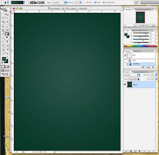
3. Now use filter: add noise: 1.6%, uniform distribution, monochromatic.
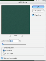
4. Create a new layer.
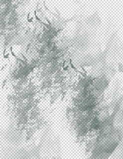
5. Using your favorite grungy watercolor brush, stipple on some lighter texture areas.
6. Create a new layer.
7. Using a different grungy watercolor brush, stipple on some darker texture. (Only the watercolor layer is shown)

This looks pretty good by itself, but at this point I'm going for some realism...
8. I found an image of really scratched up steel...
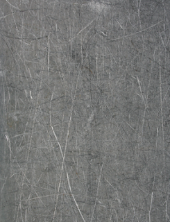
and put it in a new top layer at 14% opacity... then set the layer blending option to color dodge.
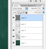
You could also use a large soft brush to mask out any parts of this layer that you don't want to be very obvious, but the image I used turned out to be pretty good.

You can play with your settings to get the best possible image for you. Enjoy!
Let me know if this helps you at all... and I'd love to see some of the results!
Creating a realistic chalkboard in photoshop:
1. Create new document, 8.5x11
2. Create and Fill a new layer with a radial gradient. I used 2 green colors, with the lighter hue in the middle.
RGB value 8.56.40 (cmyk 87.49.79.61) light green
and 42.83.73 (cmyk 81.47.65.38) dark green

3. Now use filter: add noise: 1.6%, uniform distribution, monochromatic.

4. Create a new layer.
5. Using your favorite grungy watercolor brush, stipple on some lighter texture areas.

6. Create a new layer.
7. Using a different grungy watercolor brush, stipple on some darker texture. (Only the watercolor layer is shown)

This looks pretty good by itself, but at this point I'm going for some realism...
8. I found an image of really scratched up steel...

and put it in a new top layer at 14% opacity... then set the layer blending option to color dodge.

You could also use a large soft brush to mask out any parts of this layer that you don't want to be very obvious, but the image I used turned out to be pretty good.

You can play with your settings to get the best possible image for you. Enjoy!
Wednesday, July 8, 2009
home-made chalk board
Tuesday, July 7, 2009
No HSPA awards this year...
There will be no advertising awards for my design group this year. Not due to any lack of wonderfulness on my part, but I've found out that our upper management has neglected to tell me of the WAY over deadline of June 12, 2009 for entry submissions.
I realize that I should have kept better track of such things... But I know for a fact that they get those entry submission packages WAY in advance. For the record... I would have sent my own money in to enter.. the darn tightwads wouldn't have even had to put up the lousy $100 bucks....
Here's a link to the last 2 years standings- Just to prove that I MIGHT have won a few more this year had been given the opportunity...
Awards are Fascinating!
Monday, July 6, 2009
There's Beans!
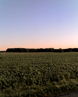
There's Beans! Sorry folks, couldn't resist. On the ride back from the ever famous Mall*Wart shopping trip, I noticed that all the fields had finally filled in after the late planting season start.
Subscribe to:
Comments (Atom)


